The Two Tailed Mermaid Starbucks Logo
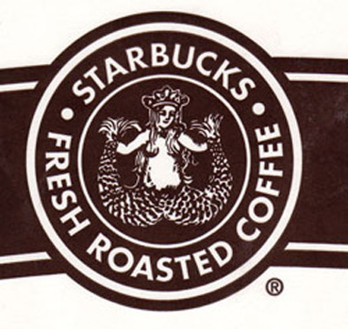
Image 2.1 1971 First Starbucks logo
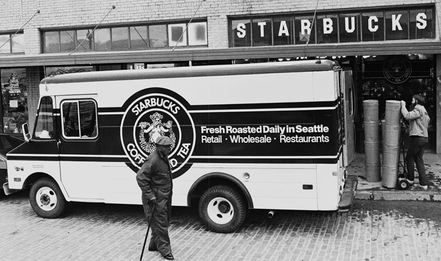
Image 2.2 A Starbucks truck with the controversial logo on it
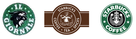
Image 2.3 Extreme right shows the 1987 logo
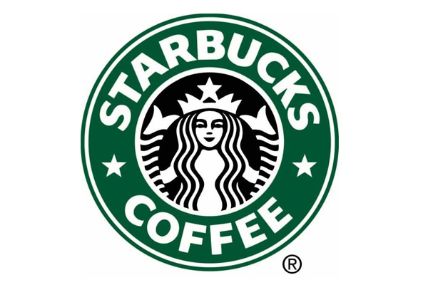
Image 2.4 1992 logo without navel
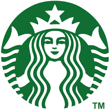
Image 2.5 The Latest Starbucks logo
|
The Starbucks logo is considered one of the most recognized logos in the world. This logo has been undergone changes a few times as well.
In 1971, Starbucks (then a mere fledging coffee shop on the Seattle waterfront) was looking for a logo, something that would embody the seafaring history of its home city. The three founders hired a consultant named Terry Heckler. According to CEO Howard Schultz, Heckler “pored over old marine books until he came up with a logo based on an old 16th-century Norse woodcut: a two-tailed mermaid.” The mermaid was exotic. She was also topless. At first, and despite some complaints, Starbucks just rolled with it. As Schultz later explained, “Bare breasted Mermaid was supposed to be as seductive as the coffee itself.” But then the time came to put the logo on the delivery trucks, and that was problematic. After failing to convince the original owners of Starbucks to serve espresso beverages, Schultz raised the seed capital to open his own espresso café, Il Giornale in 1986. “Our logo reflected the emphasis on speed. The Il Giornale name was inscribed in a green circle that surrounded a head of Mercury, the swift messenger god.” In August 1987, the two remaining original owners of Starbucks sold their six stores, roasting plant and Starbucks name to Schultz. “To symbolize the melding of the two companies and two cultures, Terry came up with a design that merged the two logos. We kept the Starbucks siren with her starred crown, but made her more contemporary. We dropped the tradition-bound brown, and changed the logo’s color to Il Giornale’s more affirming green.” The hybrid logo also became more modest with her wavy hair covering up her bare breasts, but the split-tailed mermaid was still a little too risqué for some folks. So in 1992, Terry revisited the design with Doug Fast and created the logo we see today. They cropped the siren so that only a hint of her tails was visible, and she lost her prominent navel. The Starbucks logo underwent another overhaul in 1992, when the image of the mermaid was given a closeup view and her navel disappeared from the design. The original brown siren did make a re-appearance for a brief time in 2006 to celebrate Starbucks 35th anniversary. The current version of the Starbucks logo was unveiled in 2011, as part of the company’s 40th anniversary. The revised, streamlined logo received harsh criticism from design experts and popular audiences alike. The controversial “wordless” redesign removed the outer green circle that featured the “Starbucks Coffee” brand name, while enlarging the inner siren. |
